Ad Stars: Abelson-Taylor (Azor)

CUT THROUGH THE CLUTTER
agency: AbelsonTaylor
brand: Azor
client: Daiichi Sankyo
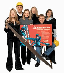
photo from left: Melissa Bauer, account supervisor • Mark Wasserman, associate creative director, copy • Joanne Casey, senior copywriter • Natalie Sandstedt, account director • Brian Wheatley, associate creative director, art • Jane Betz, senior art director
With its striking use of color and powerful imagery, AbelsonTaylor's campaign for Azor visually captures its unique mechanism of action—two antihypertensive agents working together to lower blood pressure.
Using Douglas Fraser's retro-modern art style to capture the power and strength of the drug, AT created a unique branding style that carries through to the sales material and patient information.
Rather than focus on lowering blood pressure, the creative team concentrated on "cutting" hypertension, which they felt was a more aggressive sound bite for the Azor sales reps.
The strength of the artwork stands up to the power message. But AT also gets a vote for accuracy: The section of the sphyg that the two workers are sawing is actually the point at which blood pressure is supposed to be.
"It is no secret that the hypertension market is very crowded," says AT's Natalie Sandstedt. "We needed something that was going to stand out and pop, and I think the imagery working on the red background helps solve that problem."
Azor debuted in the market in October, along with this launch ad. According to AT, the journal ads tested very well with physicians and received total buy-in from sales reps.
HOME ›› NEXT AGENCY
Addressing Disparities in Psoriasis Trials: Takeda's Strategies for Inclusivity in Clinical Research
April 14th 2025LaShell Robinson, Head of Global Feasibility and Trial Equity at Takeda, speaks about the company's strategies to engage patients in underrepresented populations in its phase III psoriasis trials.
Beyond the Prescription: Pharma's Role in Digital Health Conversations
April 1st 2025Join us for an insightful conversation with Jennifer Harakal, Head of Regulatory Affairs at Canopy Life Sciences, as we unpack the evolving intersection of social media and healthcare decisions. Discover how pharmaceutical companies can navigate regulatory challenges while meaningfully engaging with consumers in digital spaces. Jennifer shares expert strategies for responsible marketing, working with influencers, and creating educational content that bridges the gap between patients and healthcare providers. A must-listen for pharma marketers looking to build trust and compliance in today's social media landscape.