Ad Stars 2011
Pharm Exec's annual feature applauding the people behind the best of pharma advertising over the past year
As with most everything in life, there are always two sides to every story, two dissenting views on a situation. What might be repulsive to some (peeing on the side of the road) may resonate with others (peeing on the side of the road!).
It's no different in pharma advertising, where innovation has been slowly stifled by rampant cost-cutting throughout the industry. It is this showcase of creativity in an otherwise trying environment that makes this year's Ad Stars all the more impressive. In fact, succeeding in a resource-constrained environment is something to be lauded: "Tighter budgets encourage innovation. People need to work a bit harder to get business," says Jay Carter, senior VP and director of strategy services at AbelsonTaylor.


GETTY IMAGES / HIROKI - RUSH OF HAPPINESS
This year's group proves innovation has not been held back in the face of adversity. From the clever use of a CFC light bulb, to a baby with telekinetic powers, to a trailing dark cloud, messages were relayed loud and clear to consumers.
Of course, nothing about the creative process is simple; it takes time, trials, and effort to bring an effective idea to light. But being simple yet effective is key, according to Al Topin of Topin Associates (see "The Brand Promotion Gauntlet").
According to Topin, simple delivers clarity, leads to relevance, and enables big ideas that are memorable—and, hey, what's the point of an advertisement if it's not memorable, right?
For Carter, what's complicated isn't a deterrent at all. "The industry has always been regulated. The invasiveness of the regulations waxes and wanes, but it is a constant. For me, finding things that work brilliantly in the face of regulation is part of the fun, part of the challenge."
Ad Stars 2011 is the story of the people behind the best of pharma advertising over the past year. It gives credit where credit is due to those who developed, wrote, shot, and designed the spots you've seen all over television, in print, and online. These are the people who help bring the compelling messages to the forefront. It's their job to find out what it feels like to be the BPH sufferer, the depressed soccer mom, or the spasmodic child. And they've done a masterful job. The following pages are Pharm Exec's way of applauding them.
Arresting Tremors
AbelsonTaylor
CLIENT: Questcor Pharmaceuticals
BRAND: Acthar
AGENCY: AbelsonTaylor
CREATIVE TEAM: Joe Pajkos, senior art director; Stephen Neale, senior vice president and executive creative director; Jonathan Davila, senior copywriter; Rob Kienlie, vice president and creative director
LEFT TO RIGHT: Mark Sircar, associate creative director–copy; Janet Kleve, creative director; Nick Rambke, account supervisor; Jonathan Davila; Joe Pajkos; Yuliya Chepurnaya, senior art director; Rob Kienle
Infantile spasms is a serious, frightening disease, made even more disturbing by the fact that those who suffer from it are usually between four and eight months of age, and that parents can often only watch helplessly as their children suffer. Potential long-term effects of infantile spasms can be as serious and frightening as the condition itself, including cognitive impairment, neurological complications such as epilepsy and autism, and motor development concerns.

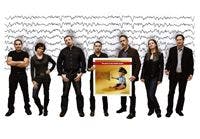

In an area where fear is already so prevalent, AbelsonTaylor made a conscious effort with its sales literature concerning Acthar—aimed at child neurologists—to convey empowerment, hope, happiness, and good health, implying that Acthar can be the very opposite of everything infantile spasms means to the physicians and parents who face it.
Child neurologists easily recognize the EEG brainwaves on the left of the image as characteristic of infantile spasms. And the happy, healthy baby sitting up next to the brainwaves is more than just cute. "By the baby sitting up, we're actually suggesting that with Acthar, the baby can reach normal developmental milestones, because in some infants who have this condition, sometimes these developmental stages are inhibited," explains Joe Pajkos, senior art director.
In addition, the hand raised in the stop position and the police officer outfit symbolize power that is in direct juxtaposition to the often helpless feeling associated with the condition. "It's not going to be uncommon for child neurologists to see images of babies looking happy and healthy," says Stephen Neale, senior vice president and executive creative director. "But we've gone an extra step symbolically, to put the baby in a cop's outfit, to say that once the baby is given this product, it now has the power to stop this disease."
"The way that doctors described this ad, they thought it conveyed strength, hope, happiness. It was easy for them to understand," adds Jonathan Davila, senior copywriter.
What makes this ad stand out is that rather than focusing on the disease, or even really on the product itself, it focuses on the patient—in this case, the infant—and the patient's ability to overcome the condition. "Dressed as a cop, the baby is able to have power over his own destiny," says Rob Kienlie, vice president and creative director. "He is able to overcome this condition that exists within him. And that's really what conveyed the sense of hope and optimism for the future that resonated so well with doctors and made the ad come to life." – JR
The Eye of the Beholden
Dudnyk
CLIENT: Inspire Pharmaceuticals
BRAND: AzaSite
AGENCY: Dudnyk
CREATIVE TEAM: Christopher Tobias, executive vp and chief scientific officer; Laurie Bartolomeo, associate creative director–copy; John Kemble, associate creative director–art
LEFT TO RIGHT: Laurie Bartolomeo, John Kemble, Scott Harper, account group supervisor
Dudnyk's Metal Man AzaSite bacterial conjunctivitis campaign spans print, Web, sales rep materials, and 2-D barcodes to reach ophthalmologists through as many avenues as possible.
In a world where the competition consists almost solely of brochures full of closeups of red, splotchy eyes, Metal Man exemplifies the symptoms of bacterial conjunctivitis in a new way. "In the ophthalmology journals, there are a lot of eyes, for obvious reasons. The target audience likes to see eyes—that has a lot to do with how they visualize the disease or their patients. What this creative team set out to do was be able to land in that area but not look like everyone else," explains Christopher Tobias, PhD, Dudnyk's executive vice president and chief scientific officer.

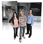

"The metal surface of Metal Man's face is a metaphor for the ocular surface—the region around the eye—and the rust is a metaphor for bacterial conjunctivitis and the symptoms that it causes," adds Laurie Bartolomeo, Dudnyk's associate creative director, copy. In the "after" image, Metal Man's rust has cleared up, and he is visibly happier and more "himself" again.
This striking visual of the rust and the metal not only stands out from the competition, but also captures the misery and subsequent relief of a patient who is suffering from conjunctivitis and then finds a solution. "People go to see an eye care professional usually because they're miserable. And the specialists like making their patients
happy. In addition to the resolution of the eye symptoms, Metal Man obviously goes from being very irritated and miserable in his expression to being happy afterwards, so I think the specialists really responded well to that emotional connection," says Bartolomeo.
The Metal Man campaign becoming such a success, according to Dudnyk, is a testament to the client, AzaSite, as much as to the agency. "We're really lucky to have a client that trusts us, and has an amazing understanding of the market and target audience, and is able to make the kind of creative decisions that have an impact on the brand," says John Kemble, Dudnyk's associate creative director, art. – JR
The Jumpstarter
Heartbeat Ideas
CLIENT: Auxilium Pharmaceuticals
BRAND: Auxilium's Low Testosterone Therapy
AGENCY:Heartbeat Ideas
CREATIVE TEAM: John Washburn, creative director; Wendy Hook, group account director; Lee Slovitt, vp, media director; James Talerico, executive creative director; Adrienne Imbriaco, video producer; Elizabeth Glaessner, senior designer; Mohammed Beshir, Flash designer
LEFT TO RIGHT: John Washburn, Wendy Hook, Lee Slovitt
Some men need a "pick-me-up" in the morning—a cup of coffee, an energy drink, a bowl of granola. Some men come into the office, stare at the mounds of paperwork on their desks, and just aren't able to muster up the strength to begin their work. It's not procrastination and it's not lack of ability—it's lacking the energy to get moving.


Some men need a pick-me-up at other times, too. And it's this idea that sparked Heartbeat Ideas's creative process while working on Auxilium's low testosterone therapy campaign. The therapy is a topical gel applied daily for those with low testosterone—a performance-boosting cup of coffee, if you will. "Our strategy was based on the insight that something like 90 percent of symptomatic men are undiagnosed," says John Washburn, creative director at Heartbeat Ideas. "The strategic position of the communication was to raise awareness of the condition in a way that would segue neatly into a brand message."


The creative team had a very close, collaborative relationship with the client, according to Washburn. "During the development, Heartbeat collaborated closely with the Auxilium brand team and we held multiple brainstorming sessions. Collectively we were able to leverage each other's skills and experience to achieve the campaign goals and deliver an outstanding campaign," says Eric Karas, senior product manager at Auxilium.
But broaching a sore subject with a sense of humor takes a certain tact. "We had to be very, very careful on how we approached humor in the topic," says Washburn. Yet emotional areas still needed to be explored in a way that educated the consumer while being sensitive to the issue at hand. "It's possible with low testosterone to have completely adequate sexual function but just no libido to deliver," he says. This is in stark contrast to erectile dysfunction, another sexual issue that males are well informed about—which had to be overcome.
So what makes the campaign so compelling? Says Washburn: "I think the work is, in large part, successful because we paid a lot of attention to casting. We hired really good actors, who could deliver nuanced performances with little to work on. Our main guy has basically no lines! He just kind of grunts. But he's able to bring a lot of humor to that. And the wife character? She's in the ad for literally a few seconds, but you can identify with them and see them as a couple very quickly. I am very proud of how we executed the ad in a way that felt respectful and sensitive to the subject yet managed to make it
feel believable." – JS
Expecting More
Intouch Solutions
CLIENT: Abbott Labs
BRAND: Humira
AGENCY: Intouch Solutions
CREATIVE TEAM: Marty Canniff, creative director; Craig Johnston, associate creative director; Svitlana Kochman, senior copywriter; June Lee, art director; Molly Buczynski, account director
LEFT TO RIGHT: Marty Canniff; Svitlana Kochman, Angela Tenuta, vice president, client services; June Lee, Molly Buczynski
An exit sign, running water, a street map ... to many people, these are seemingly unrelated images. To a person with Crohn's disease, they are signs of the behaviors they engage in to "manage" their disease—what Intouch Solutions calls "workaround behaviors"—ways that many Crohn's sufferers adapt their lifestyles and change their habits to work around their disease, instead of seeking a more effective treatment.


The Intouch 2010 Humira Crohn's campaign does more than let patients with Crohn's disease know about a new treatment they should try. Instead, it uses images and an online quiz to help patients recognize common behaviors they are engaging in to manage their disease that may impact their lives in a negative way. The online "Crohn's Workaround Quiz" asks five questions: "Do you know the locations of all the 'best' bathrooms? Do you often choose the spot near the door—just in case? Do you excuse yourself often to use the bathroom? Do you skip meals to try to avoid Crohn's symptoms? Do you find yourself hiding behind running water?"


Asking questions like these helps patients feel a sense of community and helps them realize they are not alone in these behaviors. Focus groups helped the creative team behind the campaign learn about these workaround behaviors. "It's a very private disease," says Marty Canniff, creative director. "When we did a little bit of research, the insight that we got was that these patients don't tell a lot of people, including their spouses or their physicians, what exactly they're going through."
But how does recognizing a population's disease management tactics—and helping that population to recognize these behaviors in themselves—lead to behavior change and ultimately lead to the brand the campaign is promoting? Canniff explains that though the patients initially believe these behaviors mean they are managing their Crohn's disease well, the lifestyle change is often larger than patients realize. "One of the patients we spoke with took the night shift at work because he just wasn't able to hold a day job with all the interruptions that his Crohn's symptoms cause," he says.
Helping patients realize how big the impact on their lifestyle truly is becomes the first step in showing them that they can expect more with a different treatment option. "In addition to getting patients to recognize that they're doing these things, instead of just going into a physician's office and saying they have abdominal pain, we want to make sure that they're sharing with their physicians even these workarounds they've created, to get the doctor to understand that their current treatment probably isn't working as well as it should," says Molly Buczynski, account director.
Once patients recognize their behaviors and understand that effective treatment should reduce or eliminate those behaviors, the website leads patients to learn more about Humira. "We're trying to get patients to understand that the end goal for any Crohn's patient should be remission, and that's what they should expect," says Buczynski.
"We work on pushing them to desire a change in treatment because now they're expecting a little bit more, and then we follow that with explaining how Humira could be the solution. And then we drive them to the doctor," adds Canniff.
While many Ad Stars stand out from the crowd because of unique visuals, the Humira campaign stands out because it is active—rather than passive—advertising. Instead of presenting a brand to the patients, Intouch made an effort to relate to patients, to help them realize something about their own lives and their disease, and to motivate them with a desire for change. "Rather than presenting people who are doing well and have their symptoms under control, we're starting more from an insider's viewpoint," explains Canniff. "We're leading them down a path rather than giving them a solution right away." – JR
Mind/Body Connection
Concentric Pharma Advertising
CLIENT: Salix Pharmaceuticals
BRAND: Xifaxan 550
AGENCY: Concentric Pharma Advertising
CREATIVE TEAM: Michael Sanzen, partner, executive creative director; Adam Cohen, creative director–art; Chris Runge, creative director–copy; Joel Deitz, associate creative director–art; Phoebe Bravakis: associate creative director–copy;
LEFT TO RIGHT: Joel Deitz; Ryan Craig, product manager, Salix; Adam Cohen; Matt Mitcho, associate brand director, Salix; Chris Runge
Have you ever played that game as a child when you look up at a cloud and name what you see? You might see a hedgehog while your friend sees a spaceship? Same cloud—different perspective. Some of the most successful advertising campaigns succeed because they can relay a sentiment in distinct ways to each and every consumer, while still delivering a clear, targeted message.


As Concentric Pharma Advertising—the creative team behind the Xifaxan 550 campaign—can attest, the connection one individual makes initially can vary greatly from that of another to the exact same imagery. Concentric was tasked to build a campaign around Salix Pharmaceuticals' drug for
hepatic encephalopathy (HE), a condition not widely known. HE affects brain function as the liver loses its ability to remove toxic substances in the gut.


"One of the big concepts surrounding the way Xifaxan 550 works is that it creates a lot of efficiencies. The compact fluorescent light bulb [we used] sort of looks like a gut, but it's also extremely efficient in the way that it solves the problem of lighting. So that was how our initial three different ideas came together to create this ad," says Ken Begasse, partner and COO, Concentric. But as the concept moved forward so did the placement of the bulb. "We realized the bulb also kind of looks like a cerebrum," says Chris Runge, group creative director, Concentric, "so we thought, 'Hey, this also says something about HE,' which of course is a disease that starts in the gut and then, because your liver is incompetent, starts to express itself in the brain."
Concentric went to market with several concepts, which, like images in a cloud, can elicit varying responses. "We tested this campaign with the bulb in the abdomen and in the head, because while it's positioned in the abdomen it becomes a bit more clear what it's supposed to be—at least in our opinion," says Mike Banner, managing partner and director of client services, Concentric. "But that connection between what's going on in the gut and the ultimate impact on a patient's cognitive ability is really what resonated with physicians. So they chose the execution of the bulb in the head as the most compelling."
But when a condition impairs cognition, it also affects how physicians treat it. "We needed physicians to open up their minds to the concept of treating HE with a pill like Xifaxan 550, as opposed to how they had been doing it for the last 30 years with lactulose," says Begasse. What, then, makes this ad so effective? "A simple iconic branding image paves the way for this really simple story. It helps physicians see treatment in a new way, and that's what we really needed to happen and it seems like that's working out very well." – JS
Less Stop. More Go!
Wedgewood Communications
CLIENT: Watson Pharmaceuticals
BRAND: Rapaflo
AGENCY: Wedgewood Communications
CREATIVE TEAM: Tom Timko, chief operations officer; Keith Testa, executive creative director; Beth Mack, associate creative director
LEFT TO RIGHT: Beth Mack, Tom Timko; Keith Testa
Some things never go out of style. You hop in the car, pick up your girl, throw on some tunes, and cruise. In high school you could drive as far as your gas tank would let you. But as men get older, some can only go as far as their tank will let them. For men affected with benign prostatic hyperplasia (BPH), they desperately need to "stop the go" so they can get a move on.


"It all started with the patient experience, " says Tom Timko, vice president of operations at Wedgewood Communications, the agency behind Watson Pharmaceuticals' Rapaflo consumer ad campaign. "In just looking at all of the different symptoms that men suffering from BPH have to deal with, it was a sense of loss of control that certainly resonated the most—the frequency and urgency of having to go to the bathroom," continued Keith Testa, Wedgewood's executive creative director.


While the average age of a BPH sufferer is 65, roughly 50 percent of men over 50 are affected by the disorder. "The men we market tested this ad with literally said, 'I want to feel like I used to feel,'" adds Timko.
Watson saw this as opportunity in the market. "We knew that there was going to be a gap in the BPH market with Flomax going generic and Uroxatral about to go generic. And so we saw that now was the time to really start to try to fill that void through education. We wanted to do that in a targeted way—direct to the patient," says Lynne Amato, VP of brand marketing at Watson.
Initial response by men to the visual in the ad was literally, "I've been here before," noted Testa and echoed by Watson. It shows a middle-aged man, with his female companion of about the same age in a '64 Buick Skylark—"the car he had when he was younger," according to Timko—and touches on the embarrassment BPH can cause by literally putting the brakes on his life. It's a "lifestyle condition," as he puts it.
"If you just look at the headline, 'Avoid the Stop and Go of BPH,' it has two meanings. One is that he has to stop, get out of the car, and go, which is playful [on the act of] urination. He's got to pull over right away, and get out. But it also talks about the hesitancy of the disease. Many men with BPH, as they're urinating, have a flow that stops and starts again. ... The patient we're trying to reach is one that's going to see this image and stop because he recognizes himself within the ad," says Timko.
But education remains the watchword for Watson. "We wanted to educate patients on what the symptoms of BPH were, get them to seek care for the symptoms, and then make them aware that Rapaflo is a product available to treat those symptoms," continued Amato. "I think we found a concept that is certainly attention-getting. It sparked a lot of interest, so we think we'll run with it for a little while."
And as its intention implies: Less stop. More go! – JS
Extra Helping Hand
Saatchi & Saatchi Wellness
CLIENT: AstraZeneca
BRAND: Seroquel XR
AGENCY: Saatchi & Saatchi Wellness
CREATIVE TEAM: Stuart Fink, senior vp, creative director; Bev Pangilinan, vp, art supervisor; Paul Schmidt, vp, copy supervisor LEFT TO RIGHT: Bev Pangilinan, Paul Schmidt
"What we recognize is that there are approximately 14 million patients in the United States who have depression, and for some of those patients who try an antidepressant therapy but still have unresolved symptoms, there's more they can do," says Christopher Johnson, consumer brand director for Seroquel XR at AstraZeneca. It's that extra need that makes Seroquel XR and its new advertising campaign a conversation-starter between patient and physician.


For the person suffering from depression, it seems they can never escape the dark cloud they feel follows them on a daily basis. The poignant image—never mentioned by name—found in the advertising created by Saatchi & Saatchi Wellness for Seroquel XR is the perfect example. AstraZeneca felt there was no need for anyone to remain under that cloud. "We wanted to let people know that they could talk to their doctors about adding Seroquel XR to their current antidepressant. We needed people to know that they did not have to settle; they did not have to stop what they were doing. In fact, they could merely add something to their current treatment for a diminishing or perhaps relief of symptoms—and that's a very important point," according to Stuart Fink, senior VP and creative director, Saatchi & Saatchi Wellness.


The Seroquel XR multimedia campaign has been seen in print, online, and in television spots since the beginning of the year. A cloud hovers just behind the sufferer, tailing them as they go about their day. "What we know is that major depressive disorder affects millions of people in this country and it does not discriminate by age or by sex or gender," says Fink, a point touched upon within the demographics of the ad itself. "I think we uncovered through the research that we did that this idea of a hovering storm cloud as a representation of a person's unresolved symptoms was something that was relevant and relatable," continues Johnson. "I think watching patients respond [in testing] to the cloud as a visual embodiment of one's unresolved symptoms of depression ... was a powerful way to dimensonalize that idea."
AstraZeneca received support and feedback along the way during the creative process from the Depression & Bipolar Support Alliance and the National Alliance on Mental Illness, as well as with primary care physicians, psychiatrists, and patients, helping to confirm the effectiveness of the ad's imagery. But it all came down to education, to getting the patient to realize there are options out there, and that they should speak with their doctors.
"When you finally put all the pieces together, to see something that is powerful and real and captivating and differentiating in the category, that was the moment that let us know that we felt that we had created something quite special," says Fink. "The idea of a dark cloud hovering over one's head was something that really resonated for this patient population. It was rewarding to hear that we had, together with the AstraZeneca brand team, created something that spoke to the visual embodiment of depression." – JS
Inner Energy
Ogilvy
CLIENT: Smith & Nephew
BRAND: Smith & Nephew hip and knee replacements
AGENCY: Ogilvy
CREATIVE TEAM: Jonathan Isaacs, chief creative officer; Ann Woodward, group account director
LEFT TO RIGHT: Ann Woodward; Christine Beeby, executive group director; Daniella Tineo-Cohn, associate creative director; Tracy McFarlane, creative director; Lisa Savage, associate creative director
Agray silhouette moves seamlessly, flowing like ink through water—swimming, golfing, playing tennis. The only discernable, solid characteristics in these figures in motion are the hip and knee replacement devices from Smith & Nephew. Chief creative officer Jonathan Isaacs and group account director Ann Woodward from Ogilvy Healthworld, part of Ogilvy CommonHealth Worldwide, are two of the many creative people who took part in developing the ad campaign for Smith & Nephew hip and knee replacement products, encouraging patients to "rediscover their go."

This DTC campaign manifested as TV spots aimed to showcase joint replacement devices in a nonconventional way, delivering the message that "this isn't your grandfather's hip," according to Isaacs. "I think we tried to do something that felt much more state-of-the-art. This literally is the next generation of hip and knee replacement."


In a field of competitors where depicting movement and activity to tout the capabilities of joint replacement devices are commonplace, Ogilvy knew it had to stand out from the crowd. In one way, the agency actually achieved its goal of standing out by blending in. Using gray silhouettes instead of actors or animated characters allows the audience to place themselves in the ad, and visualize their own personality and activity level filling in the blanks. "It allows you to kind of project yourself into these people because you're not sure of the gender, you're not sure of the age. All you're sure of is that they're out there doing really energetic, exciting things," explains Isaacs.
Another differentiating factor for the Smith & Nephew campaign was that it aimed to reach a broader audience. Isaacs says that much of the competition in joint replacement ads tends to skew a bit older, targeting middle-aged or senior men and women, and that Ogilvy's campaign allows for a younger, less traditional interpretation. "Everyone has this inner energy inside—you want to get out there and do things, and this helps you do that seamlessly. We were trying to make the point that anybody who is active can create wear and tear on their bodies, and there are a lot of folks—young and old—that can need joint replacement," Isaacs says.
One added bonus to using silhouettes in these campaigns was the ability to showcase the joint replacement devices themselves, moving the focus away from actors and onto product. Smith & Nephew's joint replacement products are "state-of-the-art technology but they're also incredibly beautiful," says Isaacs. "We were very taken with them from the moment we saw them, so we wanted to integrate the joints from the get-go, and make them as much the hero as anything else in the spot. Through these silhouettes, we were literally able to show consumers how these joint replacements fit so perfectly into your body and into your life." – JR
Reach for the Clouds
Flashpoint Medica
CLIENT: Angiotech
BRAND: Quill Tissue Closure AGENCY: Flashpoint Medica
CREATIVE TEAM: Meaghan Golden, senior vp, associate creative director, lead art director; Michael Ward, vp, associate creative director, lead copywriter; Melissa Watson, senior vp, group account supervisor; Erin Ranando, account manager
LEFT TO RIGHT: Erin Ranando; Steve Frederick, executive vp, executive creative director; Meaghan Golden; Michael Ward; Melissa Watson
"In a category that has tended to be taken for granted—tissue closure, i.e. sutures—the Quill device is a radical development," according to the creative team at Flashpoint Medica, who designed the Quill tissue closure campaign.


These print ads depict a cloud in one case, and an iceberg in the other, each being sewn together with the Quill suture, with vibrant colors and larger-than-life appeal. But why use clouds and icebergs to make the audience—gynecologists, urologists, plastic/reconstructive surgeons, and orthopedic surgeons—think of tissue closure? "The cloud image was developed first—something natural, large, with a touch of magic to it," the creative team told Pharm Exec. "Not only is it something that normally could not be sutured—it also has a connotation of 'the sky is the limit.'"


Similarly, the iceberg is a large, dramatic representation, developed specifically to target orthopedic specialists, where surgeons deal with tissues that are harder/tougher than the other specialties.
In what the team calls an "old-hat" category where graphic wounds are prevalent images, Flashpoint Medica says it "needed to hit people in the eye in order to get them to see tissue closure from a fresh perspective."
The Quill campaign consisted of sell sheets, convention panels, product catalog, and a convention video, along with other materials not yet released. While Flashpoint did do some market research on attitudes, trends, competitors, and more, the concept itself was not tested—from first concept presentation, Flashpoint says the client knew they had hit the mark.
According to Flashpoint Medica, the Quill campaign stands out for the client—and for its target audience—"as a method of tissue closure that is unlike any other." – JR
Avoiding the Elephant
Langland
AGENCY: Langland
CLIENT: CRF Health
CREATIVE TEAM: Kate Spencer, global business director; Shaheed Peera, art director;
LEFT TO RIGHT: Karen Phillips, copywriter; Kate Spencer; Shaheed Peera
What do a middle-aged hairy man in furry animal slippers sitting on a toilet, an awkward geek in the middle of a love-fest with a pretty girl, and a restlessly sleeping barefoot guy all have in common? They all think they're alone in the privacy of their own homes, but all show up in ad agency Langland's CRF Health print and video ads with a physician in the room with them, diligently collecting vital patient data.


Langland's "No One Gets You Closer" campaign for client CRF Health—provider of electronic patient recorded outcomes—boldly captures the intimate moments that many competitors might shy away from in ad campaigns, publicly recognizing that those private moments are precisely the ones that data collection must pay the most attention to. Addressing the awkward elephant in the room humorously and brazenly in these campaigns has brought a great deal of attention to Langland, and to the client—CRF—which, of course, is the ultimate goal of advertising.


Kate Spencer, global business director of Langland, says that such bold ad campaigns help CRF stand out in an otherwise bland environment, and allow the personality of the client to shine through. "Competition is fierce, and the pharma industry a fairly conservative environment," she says. "Everyone is focusing on the products and the functional aspects, which doesn't really give any idea of who the company is, what the company is like, and what sort of personality they have. And to understand a bit about the company's personality really is just as important to our customers as the products they provide."
Spencer admits that there "were some raised eyebrows, even at the line drawing stage," but says that Langland consciously tested the idea out on an ethnically, culturally, and geographically diverse audience, to make sure they never crossed the line from funny to offensive. "Clinical research is all about patients, and you have to be respectful of the patients that are taking part in these trials. We didn't want to offend anyone by being perceived as disrespectful of the patient. We overcame this by making all the characters really likable, larger than life," she explains.
Art director Shaheed Peera adds, "Competitors were all doing the same thing in the same way, and what was really missing was a human side to technology and to the company, and I think that's something that we really wanted to get across—that there was a big human angle." – JR


The Misinformation Maze: Navigating Public Health in the Digital Age
March 11th 2025Jennifer Butler, chief commercial officer of Pleio, discusses misinformation's threat to public health, where patients are turning for trustworthy health information, the industry's pivot to peer-to-patient strategies to educate patients, and more.


Navigating Distrust: Pharma in the Age of Social Media
February 18th 2025Ian Baer, Founder and CEO of Sooth, discusses how the growing distrust in social media will impact industry marketing strategies and the relationships between pharmaceutical companies and the patients they aim to serve. He also explains dark social, how to combat misinformation, closing the trust gap, and more.