All Eyes on You
For years, advertising agencies have been coaxing people into back rooms at malls to review ads in exchange for a couple of dollars or a lotto ticket. Although this method of gauging ad effectiveness is useful for gathering thoughts about whether an advertisement is liked or disliked by a reader, it doesn't convey the whole story to the ad agency. Marketers want to know things like: Did you read the copy first or look at the photo? Are you distracted by a particular color? How obvious is the risk information? Does this ad have stopping power? Plus, with the mall approach, agencies must factor in the reality that many focus group participants just give the answers marketers want to hear and collect their cash.
For years, advertising agencies have been coaxing people into back rooms at malls to review ads in exchange for a couple of dollars or a lotto ticket. Although this method of gauging ad effectiveness is useful for gathering thoughts about whether an advertisement is liked or disliked by a reader, it doesn't convey the whole story to the ad agency. Marketers want to know things like: Did you read the copy first or look at the photo? Are you distracted by a particular color? How obvious is the risk information? Does this ad have stopping power? Plus, with the mall approach, agencies must factor in the reality that many focus group participants just give the answers marketers want to hear and collect their cash.


Lee Weinblatt
Rather than reaching for the market-research standby, pharma marketers are now taking advantage of an old technology that can tell exactly what consumers are looking at when they see an ad.
Eye-motion detectors have been used for nearly 35 years to electronically show what the mind is seeing, and companies like PreTesting use the technology to study how people react to ads, package designs, and displays. The device detects what areas are viewed or ignored in ads, what type of art best catches peoples' attention, and—for pharmaceutical ads—whether the consumer reads the risk/benefit information. Here, I review a series of print ads and explain why they work and, more importantly, what could have been done better.
CYMBALTA: With the Cymbalta campaign, our eye-movement recorder found that very few readers noticed the pictures and copy at the top of the ad, which show a woman bearing the strain of depression. Some of the best ads present the problem and the solution, but unless the readers are involved in the copy at the top, they won't react to the "before and after" of this ad. The copy on the right, which is all one font and difficult to read, also had very low readership.


This ad would have been more effective as a two-page spread. The blue box at the top would have worked better on the left. And the creators should have saved all that room spent on Lilly at the bottom and pushed the copy down at least half an inch. They also should have taken a key line and made it bolder and larger in the copy.
BAYER: One of the things we learned with this ad is that readers' eyes first read the "and heartbreak" line of copy before reading "helps prevent heart attacks." The good news is that the "heartbreak" line did get readers to read more of the copy. What you really want to do in any print ad or television commercial is stress the benefit of the product. For instance, if you have a drug that lowers cholesterol, do you really want to say just that, or would you rather get your audience more emotionally involved, with copy that emphasizes, for example, "can help you see your children graduate"? Many pharmaceutical ads don't drive home the very bottom-line benefit to the audience, missing a great opportunity to truly connect emotionally. Ads also should explain what makes the drug different from the competition's.

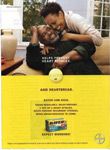
The problem this ad has is the gentleman's hand: The white text is difficult to read on top of the skin tone. Fortunately, reader's eyes are drawn to the black-on-yellow copy. In this particular case, it helps, because people were curious what that copy meant. It was a gamble that worked, but most of the time it would fail.

ROZEREM: The Rozerem ads don't work for many reasons. First of all, we found out the beaver was a turnoff. Whenever test group respondents would focus on it, their interest went down like a rock. In addition, they remembered the beaver and Abe Lincoln, but they couldn't remember the name of the product. On top of that, we found the ad was very poor in terms of "Is this brand unique?" Readers had no idea what made this product different.


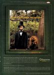
There are several mistakes here. First is the headline: It isn't easy to read against the background. Second is the body copy underneath: "It is the first and only prescription sleep aid that...shows no potential for drug abuse or dependence." Why is that there? Why isn't that as big as "Your Dreams Miss You"? If that's their key point, it should be in bold letters.
Rozerem has invested a great deal of money in an integrated campaign incorporating print ads and television commercials. This particular ad, on its own, does not readily convey what the product does or its benefits. In fact, our test showed that fewer than 3 percent read the key copy in the third line describing this product's uniqueness.
PATADAY: I understand that the red color is intended to indicate itchy eyes, but take a look at how hard it is to read the words "Itchy Allergy Eyes." That's genius. Why not make that font three times bigger? Also, why not have the name Pataday above the words "Once-a-Day Relief?" Also, the body copy could be cut down and turned into three bullet points. That would direct reader attention and unclutter the ad. Bullets say "I am making the text easy for you to follow."


The background of the Pataday ad made readership of the key copy (across the eyes) almost impossible, as was readership of the product in the lower right corner. For a new product, it is highly unusual for the ad design to so overwhelm the copy as to make it unreadable. There was almost no opportunity to brand the product, and it's ironic that this is a product for eyes when the copy is so difficult to see. Also, breaking up a line of copy right across the center of the ad—as is done to the right and left of the eyes—is not recommended.
Lee Weinblatt is founder and CEO of PreTesting. He can be reached at leeweinblatt@pretesting.com


The Misinformation Maze: Navigating Public Health in the Digital Age
March 11th 2025Jennifer Butler, chief commercial officer of Pleio, discusses misinformation's threat to public health, where patients are turning for trustworthy health information, the industry's pivot to peer-to-patient strategies to educate patients, and more.


Navigating Distrust: Pharma in the Age of Social Media
February 18th 2025Ian Baer, Founder and CEO of Sooth, discusses how the growing distrust in social media will impact industry marketing strategies and the relationships between pharmaceutical companies and the patients they aim to serve. He also explains dark social, how to combat misinformation, closing the trust gap, and more.